11 Design Trends That Will Boost Your Brand
Websites and social media feeds are the shop fronts of the C21st, so it’s important to keep them looking attractive and current to grab the attention of your prospective clients. A dull or outdated look to your homepage won’t entice people to hang around and find out more about your brand, and likewise, a social media account that’s too busy or chaotic will never be “the one” to follow.
Take a look at our designers’ guide to the latest developments in graphic design that will help you keep ahead of the game. Out goes futurism, and in comes a retro revival, with traditional typefaces making a strong comeback. On the other hand, a bold, colourful look is the way to go, as long as you know how to strike the right balance between eye-catching and sophisticated
1. Motion and Animated Graphics
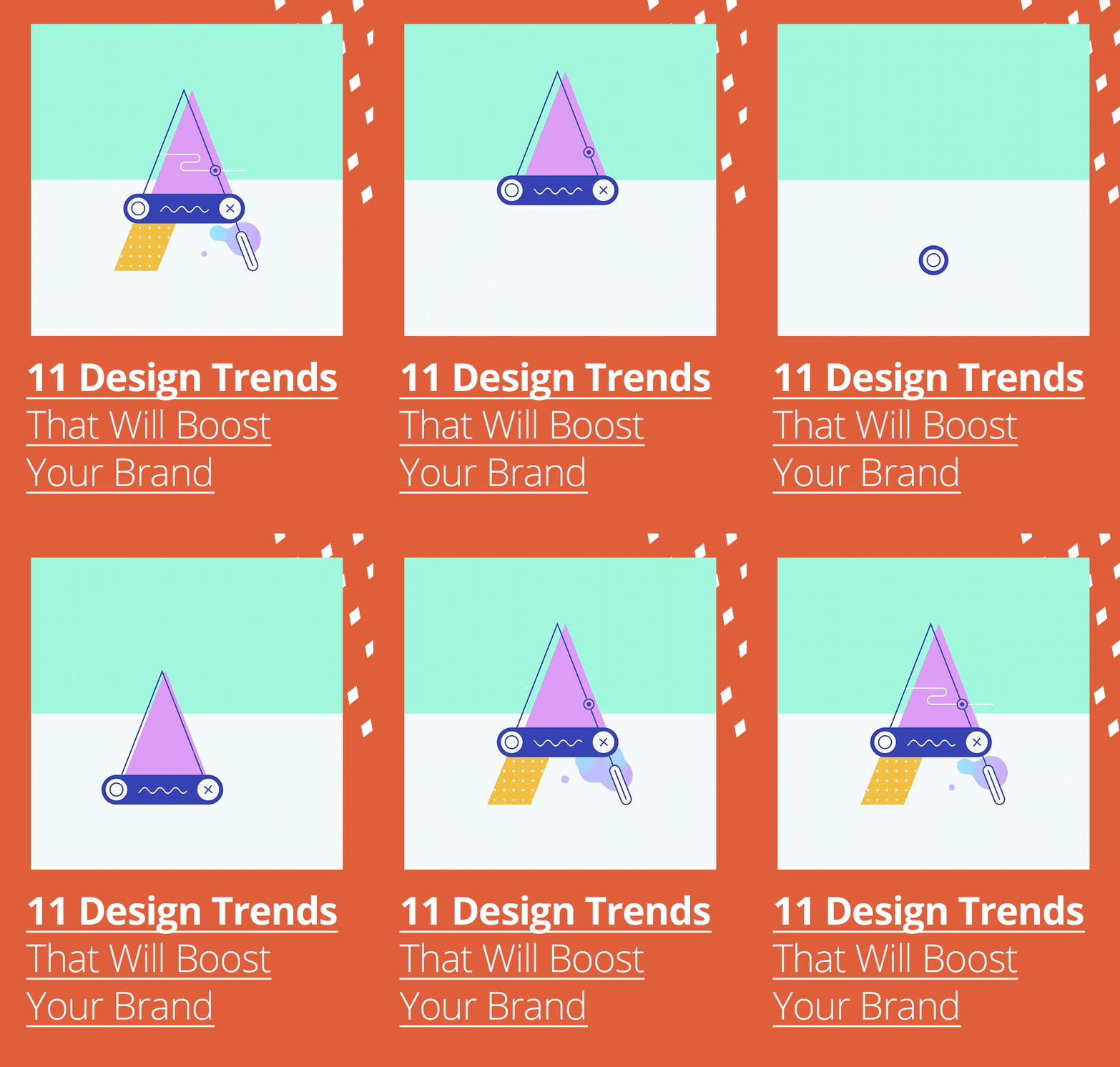
Motion graphics and animated GIFs help brands share their story and reach people in different ways. An attractive combination of visual, audio and animation is a sure-fire way of getting noticed and engaging audiences.


2. Vibrant Colours and Gradient
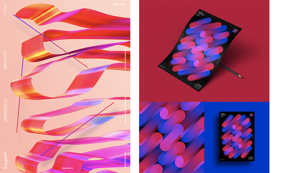
Don’t shy away from daring, supersaturated hues. Eye-catching techniques blended with bold palettes and elegant gradients grab people’s attention.

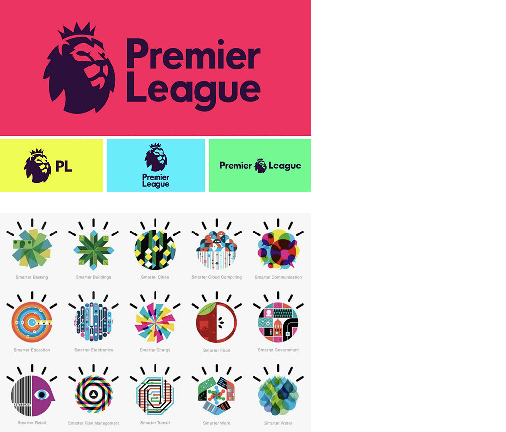
Brands are creating flexible logos, in different shapes, colours and compositions that can adapt to different platforms. A logo that fits easily in any format is more likely to ride out a change.
4. Mid-Century Modern and Retro Design Aesthetics
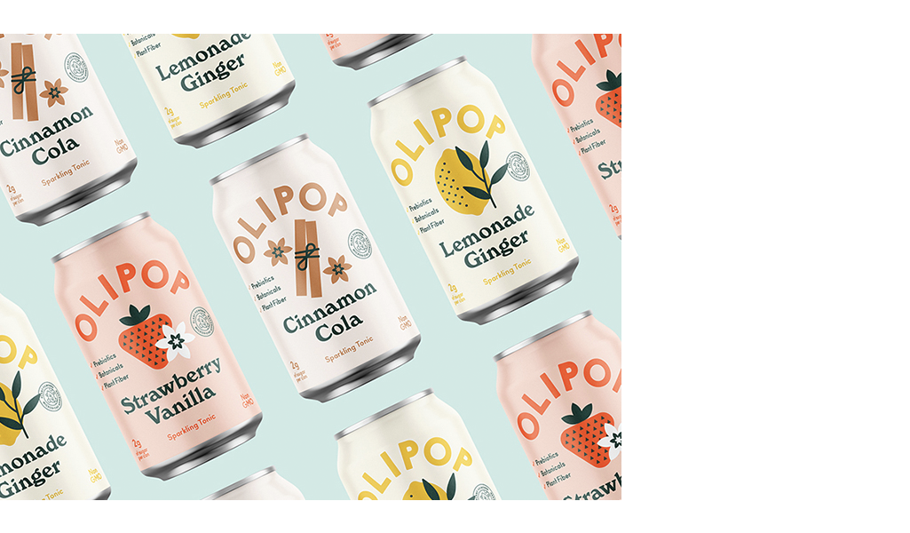
Old is the new…new. Vintage designs are returning, however with a minimalist twist, across all brand touchpoints. Minimalism mixed with a pinch of nostalgia creates sophisticated designs.
5. 3D for Bringing Your Brand to Life
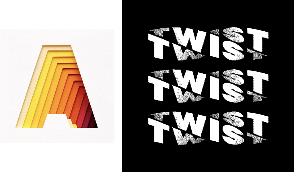
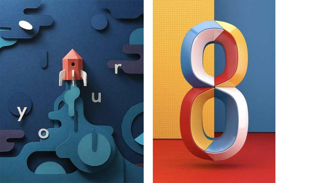
More minimalist and monochrome, 3D designs have been creating stunning visuals that look like they’re ready to jump off the page! It not only appears in illustrations but also in the typography, making for a more versatile and lively layout.
6. Patterns for Product Packaging
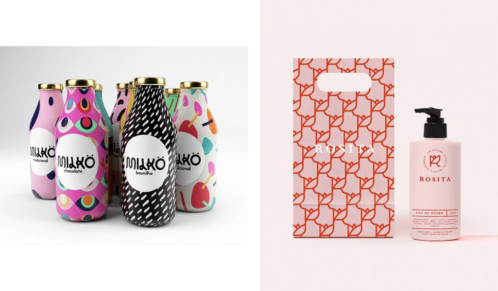
Product packaging doesn’t need to be boring anymore. The use of designed patterns makes your product stand out on the market shelves. Be different, give personality to your brand.
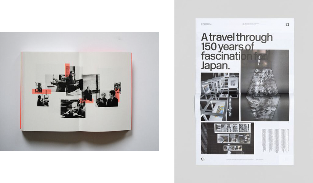
7. Asymmetrical Layouts
Diagram elements off the grid. Having an asymmetric structure is not the same as not having any structure. Distribute existing elements unevenly, but don’t forget to use balance between text and images.
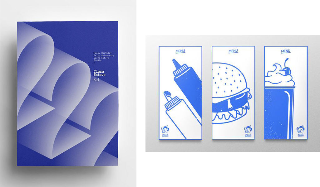
8. Monochromatic
Limiting yourself to one colour can help solidify your branding. Your content will have a lasting impression if you use just one colour in different shades.
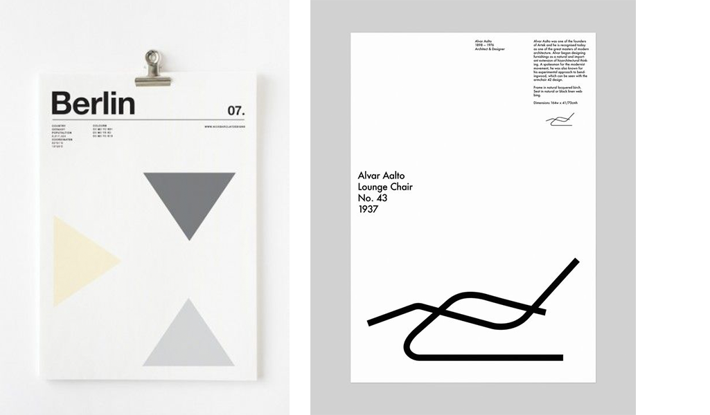
9. More than enough white space
Leaving blank space in a visual brings out a focal point. Your design will look more organised, clean, clear, and specific.
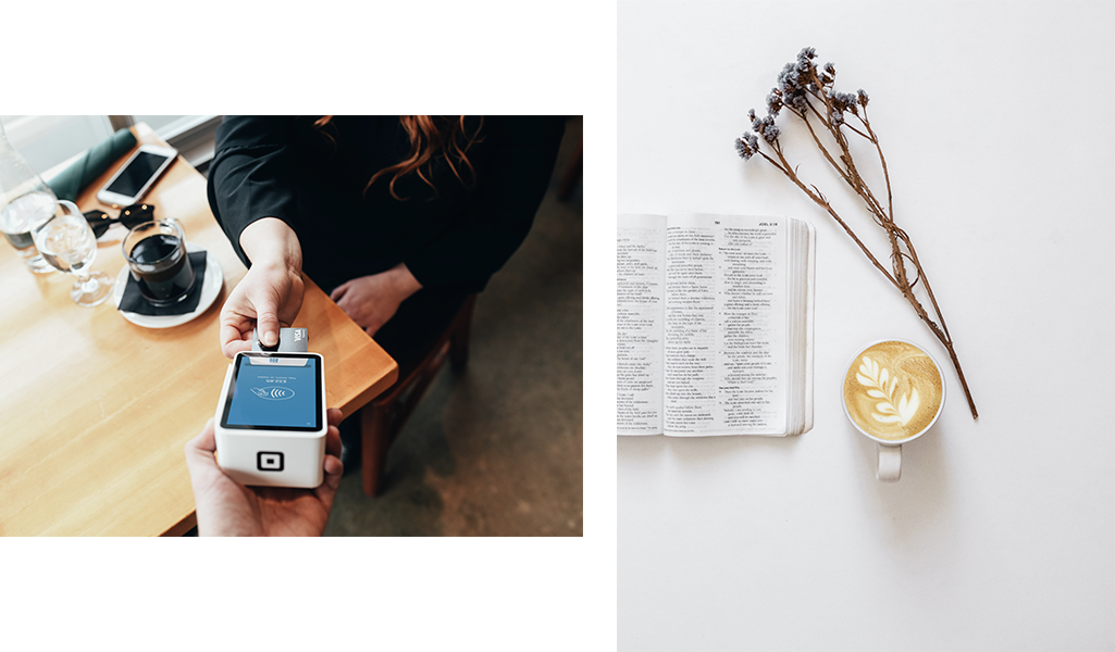
10. Authentic Photography
Use photos that look as if they were taken with someone’s phone or personal camera. It’s very “in” and completely different from what we are used to seeing on the most popular stock images website.
11. On-Trend Typography Tips
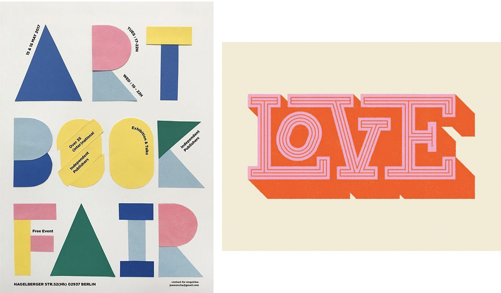
- Opt for single-colour backgrounds and over-sized fonts, usually non-serif ones like Helvetica.
- Go for text only, no image or illustration insertion on the visual, for a slick, modern and uncluttered design.
- Use serif fonts to convey a classical or vintage mood. It will look elegant and modern if used with an interesting colour palette or illustration.
- Finally, try using custom typography to bring personality to the brand and create an emotional connection with the audience.
